How I Use Color in Portraits
When it comes to my photography, keeping things simple means that certain elements become more important than one would expect. Things like color, for instance, can either enhance the portrait or become too distracting. And as someone who studied graphic design and worked in advertising as an Art Director for almost a decade, color was always an important aspect of my work. This post is all about how I approach styling, use color in my photography, and create portraits that are meaningful and beautiful at the same time.
Monotone


A lot of people are scared of white. But to me, the simplicity of a pure monotone approach is incredibly appealing. Surrounded by white, a person’s face becomes the most prominent feature of a photograph. It works spectacularly well for babies and adults alike. Paired with beautiful fine-art printing that keeps those whites crisp (and doesn’t turn them gray like typical photo prints), the result is always stunning.
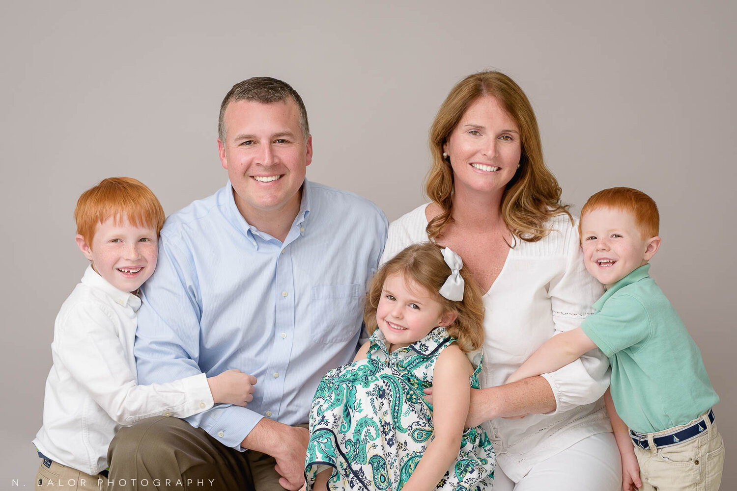
But the monotone approach doesn’t stop there. I also use it when it comes to darker shades and colors. Often, especially with headshots, there is a signature color that truly represents the person’s personality or brings out a certain feature. Like with images below, my client’s red hair and green eyes are celebrated in each portrait without being overwhelmed by other elements. The beauty of the monotone approach is just that - the focus is placed exactly where it needs to be and the restraint is always worth it.


Coordinating Colors

If you’ve seen your share of family portraits, you’ll notice that a lot of the time children are dressed in identical outfits and parents follow suit with same-colored clothing. When it falls on Mom to select wardrobe for everyone, it’s just easier to pick a single color and apply it across the board (buying the same outfit in different sizes is easy), but it also looks staged in the end.
Putting colors together is much more nuanced. When clients and I sit down to hand-select outfits as part of our in-home styling appointment, I make sure to vary colors so that each person bring their own personal style into the portrait. It makes the photograph that much more interesting and visually appealing, too.
The other important aspect of how I put everything together is infusing each family’s specific interior style into the wardrobe selection (especially if that portrait is going up on a wall in that environment). Some families have homes that are mostly white and gray, while others prefer blues and navy in their surroundings, or earth-tones. There’s no wrong answer here, but paying attention to those design details really pays off in the end.


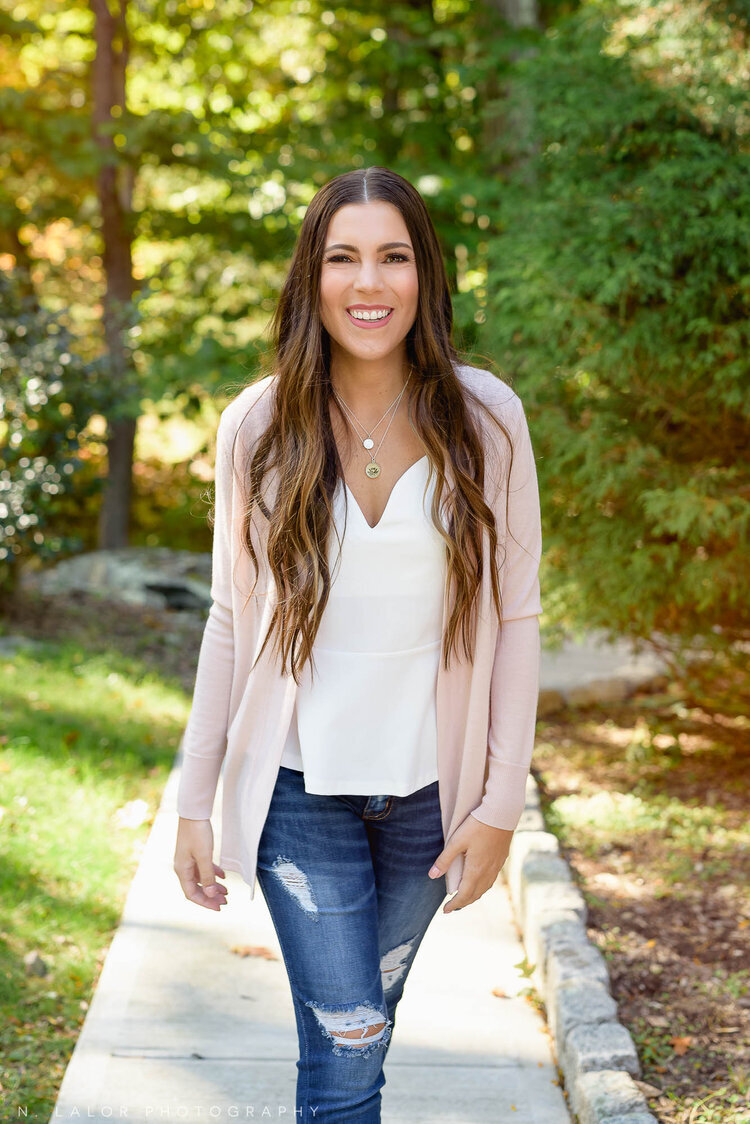
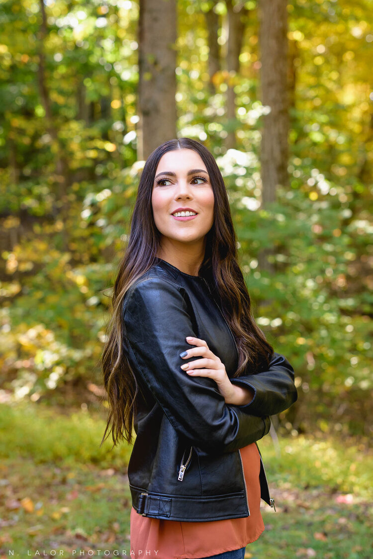
Color as an accent

My Personal Branding sessions involve quite a bit of styling upfront, and have that additional element of environment to consider. This is when accent colors become really important.
Selecting a color that separates the person from their surroundings will guarantee that they will be the most important part of the image. And when it comes to creating imagery for advertisement purposes, clarity of focus is everything. Not only that, but if there are brand colors to consider, they always have to be incorporated into the image, too.
This is another reason why sitting down ahead of time, planning outfits, getting to know each person and their brand, scouting locations, and putting together a visual photoshoot plan in PDF form is the first (and un-skippable) step of the process. Without this time spent planning, our sessions wouldn’t go as quickly and they wouldn’t produce such a polished and well-thought out result, either.
Personal Branding is all about telling a story. Whether you appear friendly and approachable or powerful will depend entirely on your pose and the clothing you are wearing. All the elements come together to speak to the viewer without you having to use any words at all.

It didn’t take long for me to learn that styling is an essential part of the photo session process. For any commercial photoshoot, there is always a stylist (or two) on site to handle all those details. And it certainly makes sense to make styling a large part of family, headshots, and branding sessions as well.. because whether we like it or not, colors play a HUGE role in how we perceive the resulting image.